Clever Designs With Sneaky, Hidden Details You Might Have Missed
As consumers, we see designs and logos countless times in a given day. Oftentimes we are so familiar with the brand associated with these logos that we think little of the design itself.
However, here is a list of clever logos and designs that have meanings you may have overlooked. Did you know that these hidden messages were disguised within your favorite logos this whole time?
Amazon's Yellow Line
Now known as having one of the richest people in the world as a creator, Amazon has come a long way since it started in 1994.
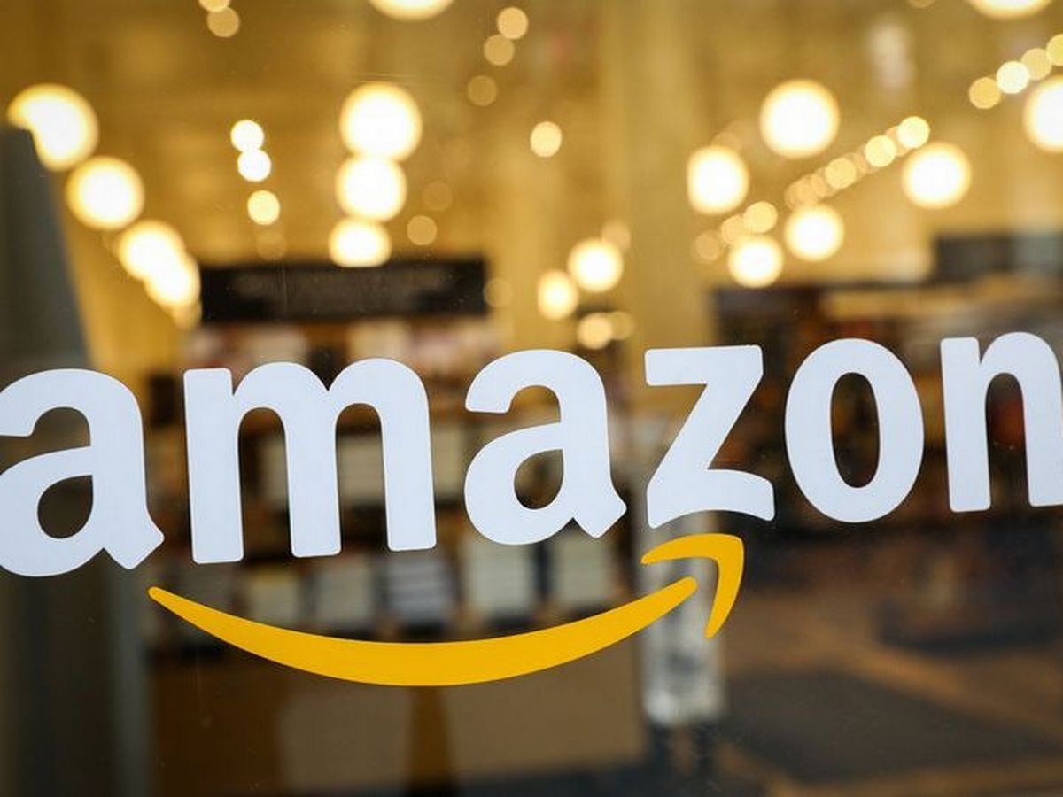
Amazon
To many, the line under the word Amazon in the logo looks like a smile or smirk coming from the brand. The thought here is that they know something that you don’t know, which is that their prices are better and more convenient. That’s the feeling, anyway. The real reason for the line is that they want you to subconsciously know that they have everything from A to Z.
Baskin Robbins
With well over 6,000 locations across the globe, Baskin Robbins is a great place to enjoy a frosty treat of delicious proportions. When the company first opened over 70 years ago, it was a notable ice cream shop due to its abundance of variety. That’s 31 flavors, to be exact.
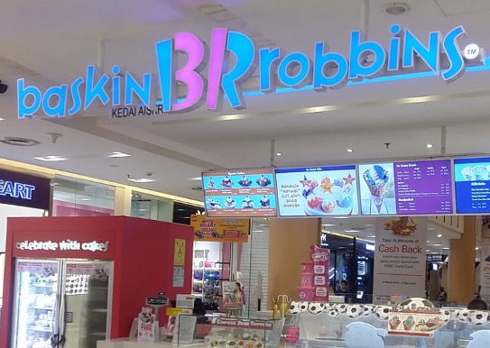
BaskinRobbins
As a constant reminder of where they came from, their logo was meant to represent that past in the sweetest way. The B and R have been combined to show 31 in pink, so it stands out. It’s subtle but appreciated.
LG, Life's Good
In over 60 years of business, this South Korean corporation has swept many parts of the world with its electronics. LG stands for Lucky-Goldstar but is also known as, “Life’s Good.” One can’t help but imagine that the latter is why the logo is winking at us.
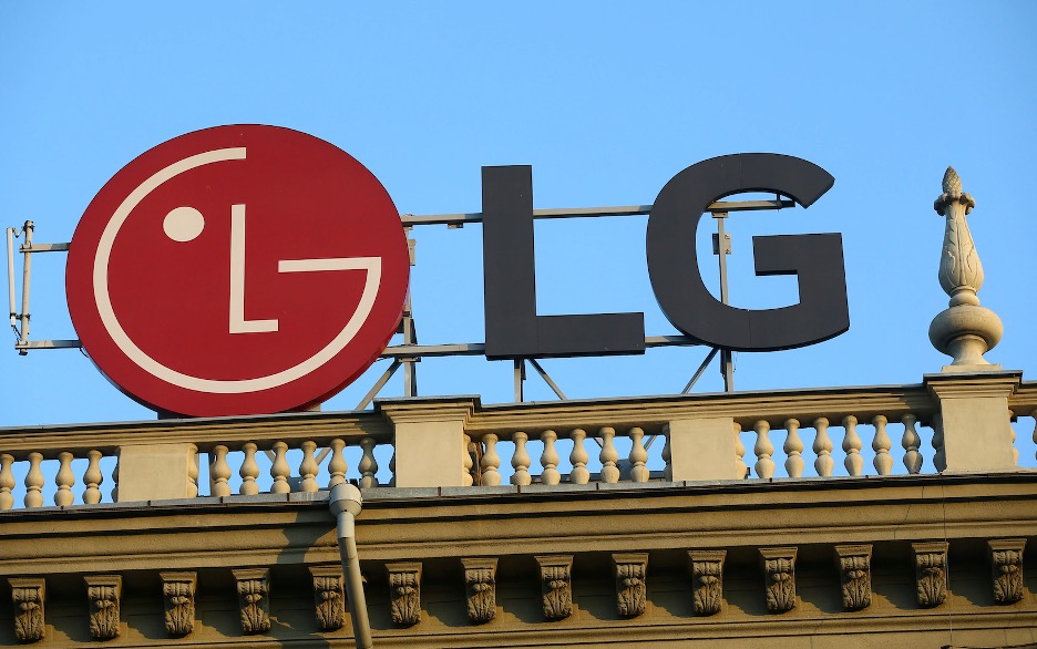
LG
It’s having a good life, right? Well, not exactly. It might double as a symbolic face, but what it really stands for is LG. Having that face next to the letters LG is a bit redundant when you notice that the round of the face is a G and the L is a nose.
Hershey's Kisses
There’s no sweeter sentiment than a chocolate kiss. At least, that’s what Hershey was intending with the introduction of a new candy to the public in 1907. The shape that fits so nicely in the palm of your hand, and is also easy to grab, hasn’t changed since it was created.
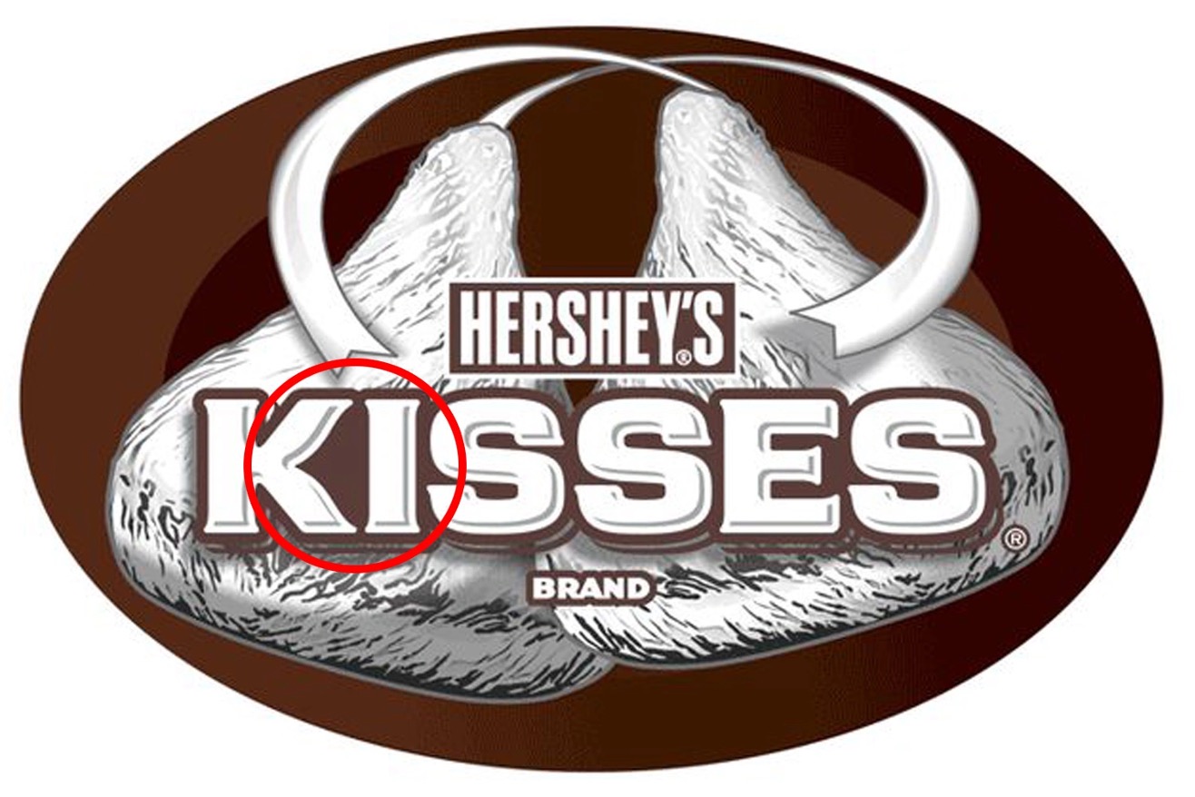
Hershey's Kisses
This chocolate company knows a good thing when it sees it. Just to prove how strongly they feel about it, the shape was engrained into the logo. Did you miss it? The K and I are written closely in a way that resembles a Hershey’s kiss in the space between.
Delta Airlines
They have loved to fly for a century and it shows. The first passenger flight Delta made was between Dallas, Texas and Jackson, Mississippi.
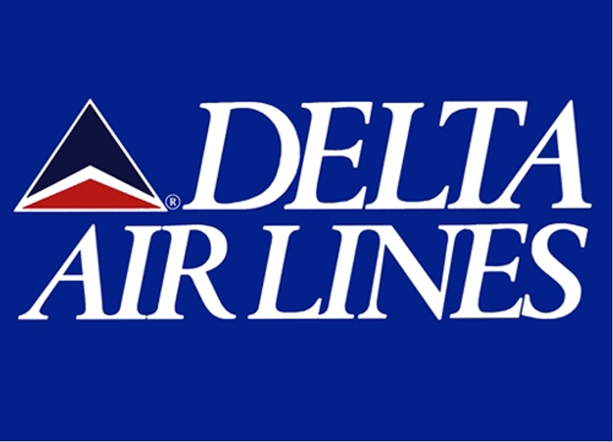
DeltaAirlines
There’s actually quite a bit to unpack from this logo. To begin with, the overall shape is the Greek letter Δ, which is the namesake of the airline. Above that are the white wings of their first aircraft. The blue on top represents the Delta region from where the company came.
Pittsburgh Zoo
This Pennsylvania zoo has been delighting the young and young at heart for over a century. With all that time to build a reputation, this animal-loving place needed a proper representation.
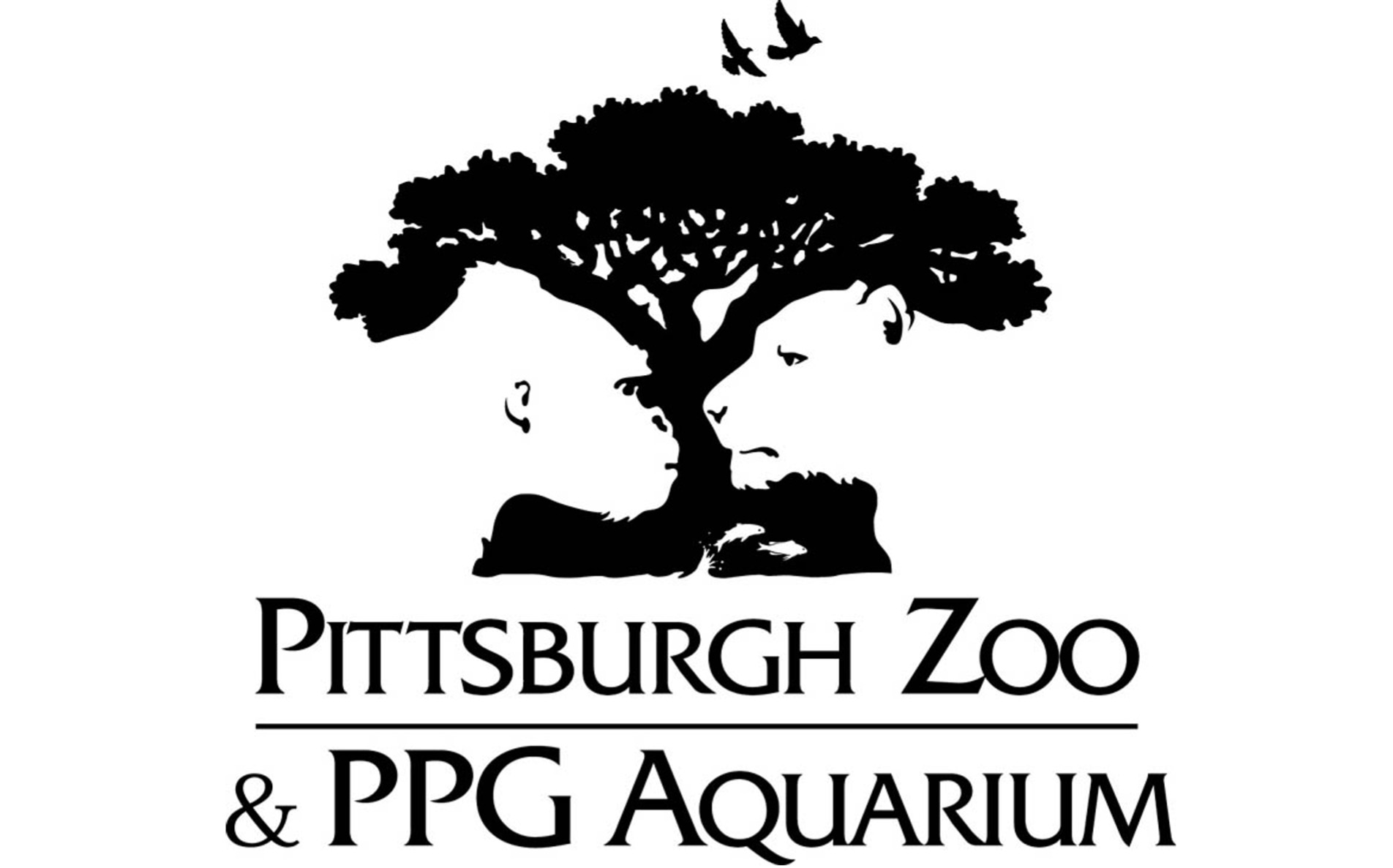
Pittsburgh Zoo
At first glance, you are immediately overwhelmed with the imagery of the beauty that awaits during your visit. However, this image is more than birds and fish embracing their home. If you look more intently, you can see the negative space taking on a wilder visual. Both a gorilla and a lion can be seen breathing new life into this logo.
Le Tour de France
For a world-famous bicycle race that is 2,000 miles long and takes place over the course of 23 days, it makes sense that the logo would be a bit cheeky. It takes a second to notice, but a biker is represented in the logo.
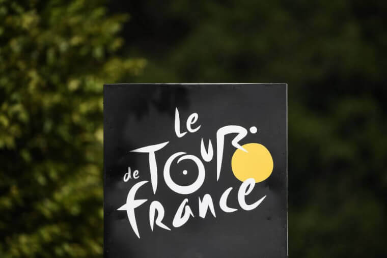
Le Tour de France
The biker, being the heart of the competition, is towards the colorful part. The majority of the word “Tour” has transformed itself into a cyclist and their machine. You can see the front wheel of the bike in yellow and letters from the word standing in as the body and bike. What a way to get creative with a logo.
BMW's Logo Theories
It’s been over one hundred years since BMW was founded and it still has one of the most recognizable logos in the automobile industry. It’s also the most controversial logo design on this list.
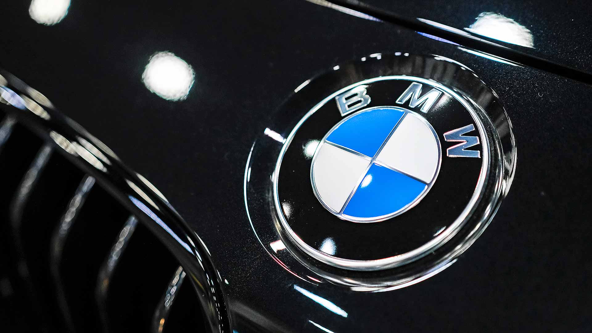
BMW
There are two different opinions on what the logo stands for. On one hand, you have people who see the blue and white as a homage to where BMW got its beginnings, Bavaria. On the other hand, people see it as a propeller in relation to WWI. It was at that time that BMW was known as an engine manufacturer.
FedEx Express
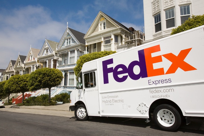
Starting in 1971, FedEx has wanted you to know that not only will they ship your belongings professionally, but that it will also be done in a timely matter. It took until the mid-90s before they incorporated that into their name. This logo is another subtle but clever message many don’t pick up on.
FedEx
It does make sense when you notice it, though. Many designs might require someone to point it out because of the use of negative space between letters. Specifically between the E and X. There you will see an arrow, a symbol for speed and delivery.
Toyota's Complicated Design
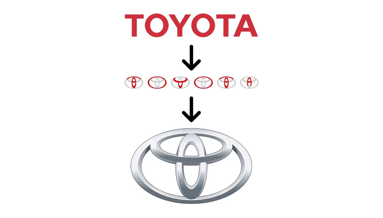
One of the most popular auto brands, Toyota, has a distinctive design that goes beyond just a logo but is also embossed onto their vehicles. To be fair, there are two explanations for this logo but we’ll start with the more complicated one.
Toyota
What’s in a name that can’t be part of a logo? Toyota sounds like a lot of letters to include in symbolism, but thanks to the above breakdown, you can see car company’s name spelt out in several ovals. The other explanation? Well, Toyota actually started out as a textile machinery firm, so there’s a thread going through the eye of a needle.
